CSS Flexbox Cheat Sheet
Flexbox is a layout model that allows elements to align and distribute space within a container.


CSS together with flexbox is one of the most important css layout module and In my experience I actually use flexbox even more than css grid. so you could even say this is the most important layout module in css
Let's quickly go for it and look at some of most common properties and some examples of them, so with flexbox it always about parent element( Main Axis) and it direct child element (Flex Items)
Start with main Axis
Display
.container{
 display: flex;
}
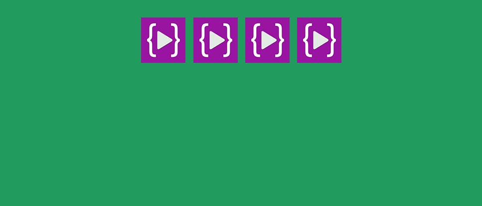
We have to define a flex container to start using flexbox model

Above example a flex container (green background color) div element with four child element images so this images are the child elements because main container define display flex and the get layout along with same row.
Flex-direction
Let's say we don't want that images(child element) horizontally like above example then you can use flex-direction: column; property to make all the image in vertical order like a column
In the default value the direction is row and we can change it in vertical order as below example.
.container{
 display: flex;
 flex-direction: column;
}
Flex direction property we only need to set column to get below layout

The direction has been changed (from top to bottom) this is the only tricky part of the flexbox.
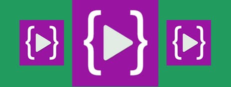
justify-content
justify content we can use to set horizontal alignment and we have 6 properties , justify define the alignment along the main axis.
You can center a div within a div with Flexbox let's understand justify-content: center; property.
.container{
 display: flex;
  justify-content: center;
}
If we set justify content property center to going to be center horizontally here , it's pretty easy to switch out. “center” this will tell the browser to center the flex item horizontally
you can see the content now placed at the center of the main axis so this the property to expect center alignment.
justify-content property has different possible values:
justify-content: start; The main axis runs from left to right,
justify-content: end; The flex-items are now moved at the end
justify-content: space-between; The flex-items are now moved at the center
justify-content: space-around; The available space is distributed between each one of the flex-items
justify-content: space-evenly; Equal space around them.
align-items
This is the behaviour for how the flex items are laid out along the cross axis
.container{
 display: flex;
 align-items: center;
}
Align items center : used to center align vertically , align item property allows you to set content at the cross axis , my goal is here to show how align in middle of that container

The align-items property accepts different values
align-items: stretch;
align-items: center;
align-items: start;
align-items: end;
flex-grow
Now the property we gonna to learn is actually flex-grow so let me add a property and do remember this is super helpful on the small scale devices even If you scale for small devices the ratio is maintain their, if you apply this property towards whole of the thing then it become easy and really amazing things no matter what your screen size it always make sure the ratio is intact their
.flex-element {
  flex-grow: 2;
}

.flex-element:nth-child(2) {
  flex-grow: 1;
}
You can see difference after adding nth-child 2 it's telling to browser add one more extra space for 2
Resize items based on different properties
flex-grow, flex-shrink, and flex-basis,
flex-wrap
So CSS flex-wrap is way to wrap flexbox item with an parent container down into basically break a new line by default the items will no break so they'll be on one single line we can break onto multiple line
Here is basic example to understand about wrap we can handle wrapping when we have more item.
.container{
display: flex;
flex-wrap: wrap;
}
Wrap property breaking flex items onto multiple lines from top to bottom.

Below value will cover basic and intermediate properties
flex-wrap: nowrap; / Default value /
flex-wrap: wrap; / flex items onto multiple lines from top to bottom /
flex-wrap: wrap-reverse; / will wrap the flex items onto multiple lines but from bottom to top /
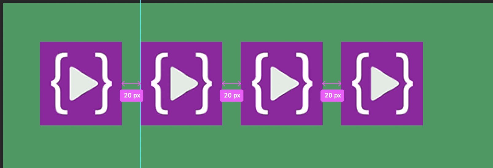
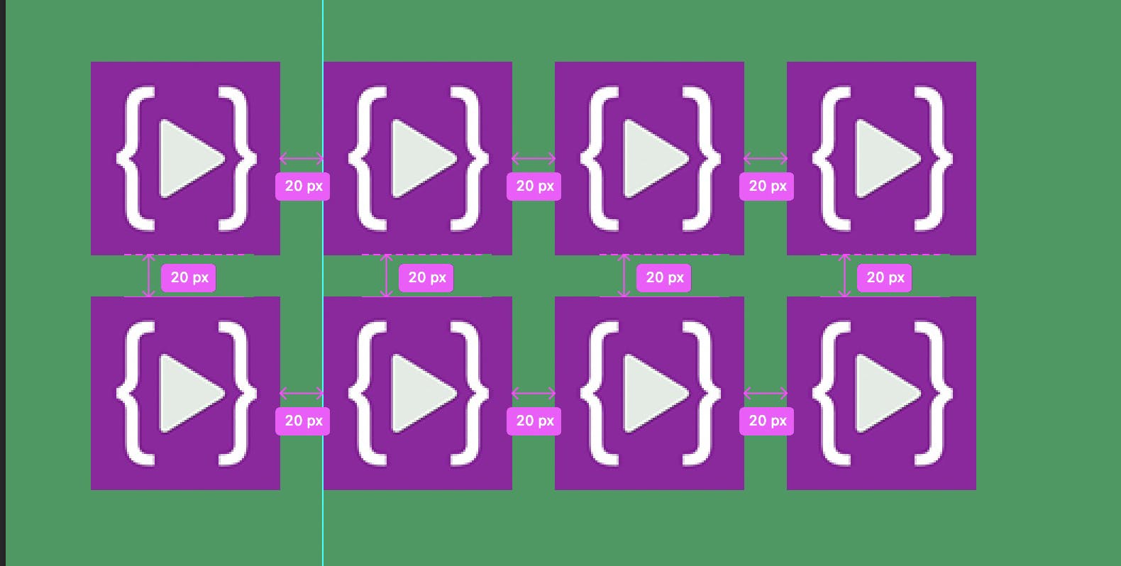
Gap
If we want some space between the flex items and they already have a little bit of space as you can see in other examples Actually I want to be able to distinguish that flex items one another but technically you actually have to use gap one of the gap properties to achieve that.
.container{
display: flex;
column-gap: 20px;
}
So lets we say that display flex right so then we get something like this but we want some space between them and we have to use column gap.
We can use row and column gap together as well.
.container{
display: flex;
column-gap: 20px;
row-gap: 20px;
}
order
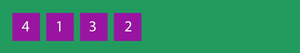
Just Imagine If we want to control the items order and need to arrange in reverse or normal way so in this case we can use order property for individual elements which flex items appear in the flex container.
<div class="container">
  <div style="order: 4">1</div>
  <div style="order: 1">2</div>
  <div style="order: 3">3</div>
  <div style="order: 2">4</div>
</div>
Default will be in order 1,2.... with the help of order property we are able to arrange div's , by default ascending order. But, once you have declared the order of flex in the flex creation, you can reverse it by mentioning the direction of the flex.